The Project
redesign the Gap Inc. Rewards Hub
This project focused on redesigning the Rewards Hub for Gap Inc. brands. Our goal was to create a user-friendly, scalable loyalty destination that consolidated scattered information, simplified navigation, and encouraged greater customer engagement.
Where do I fit in?
My Role
Lead UX Designer for all Gap inc. Loyalty
Responsibilities
Design & Deliver Reward Hub for all 4 brands on app + web
Engaged with
Business, Strategy, Operations, Engineering
The Problem
Current State
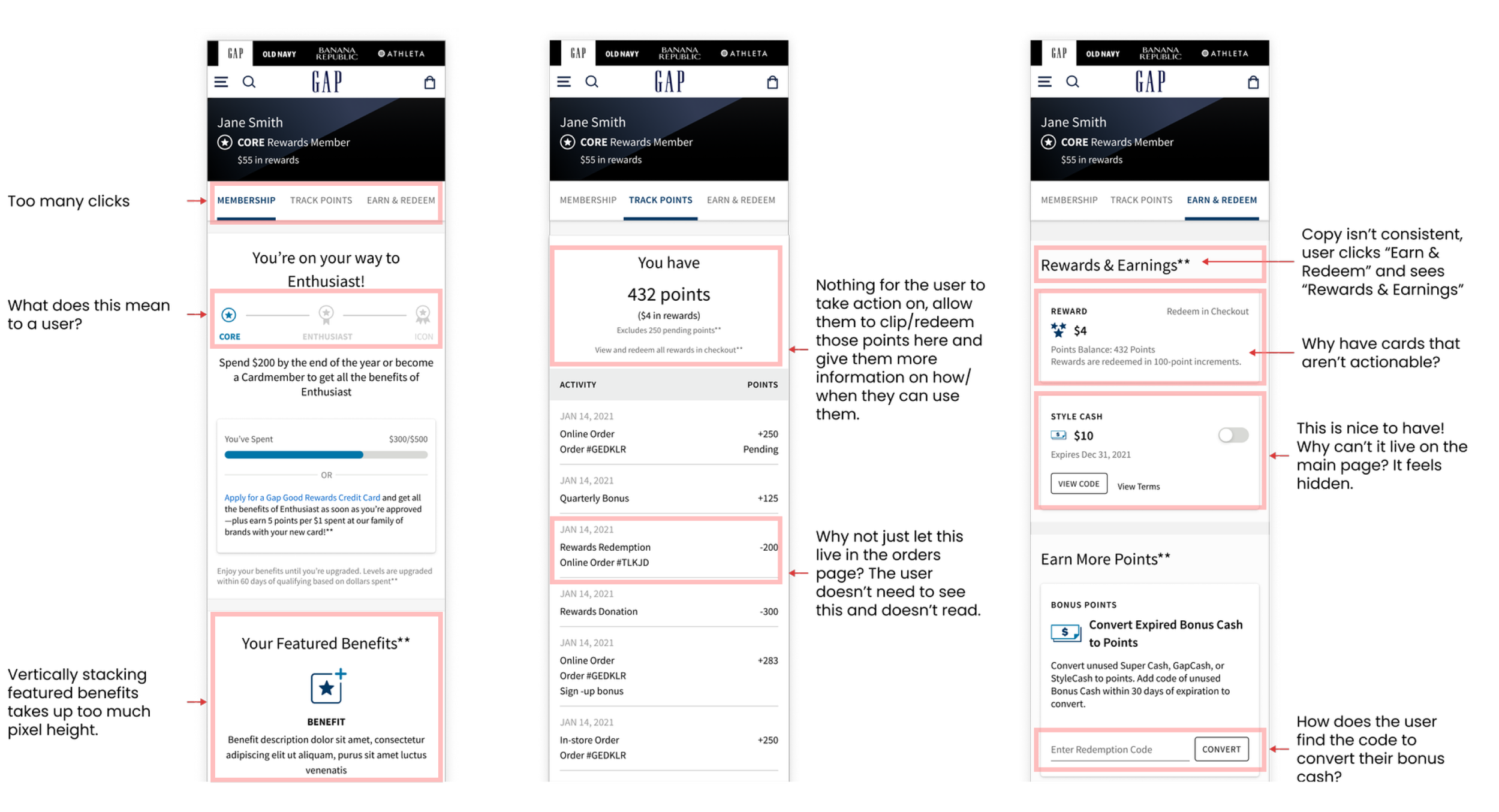
The current Rewards Hub was launched as an MVP without a data-driven foundation; an experience audit identified several gaps and pain points across the experience.
the Business Problems
Gap inc. was suffering from declining user retention, poor understanding of its rewards program and difficulty scaling an inflexible system.
The User Problems
Audits across web and app uncovered core usability issues that made the experience difficult to understand, navigate, and use.
Internal Alignment
From Problems to Opportunities
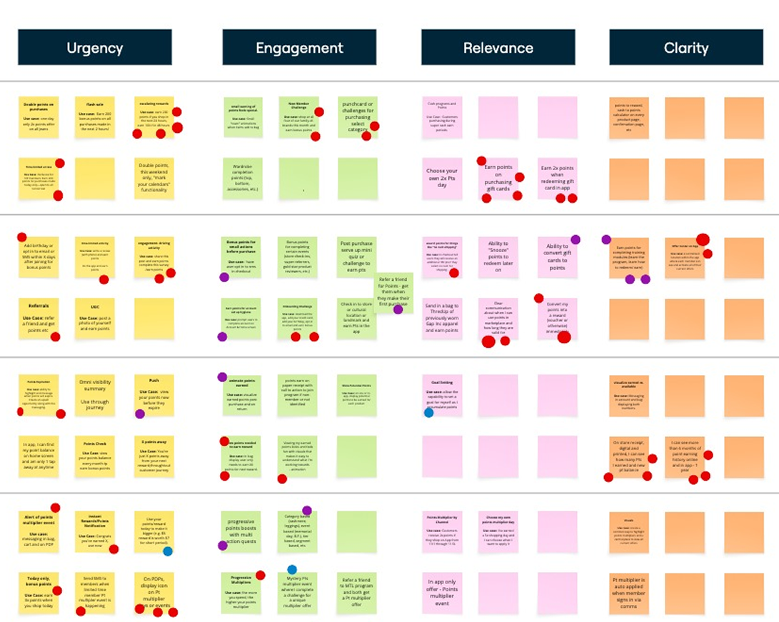
Stakeholder workshops helped align on future goals and capabilities, turning identified pain points into actionable opportunities
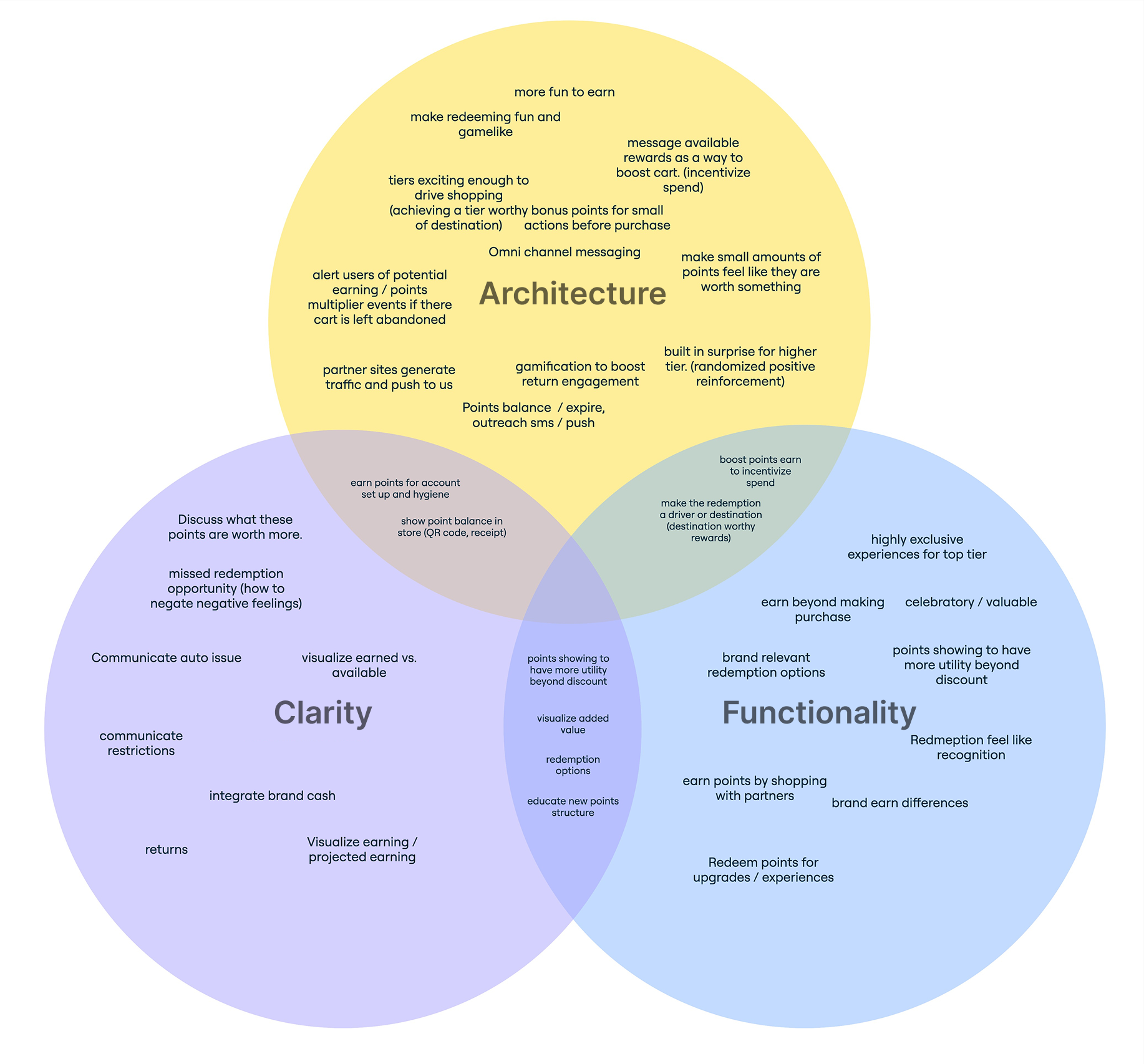
Strategic Alignment
Three key opportunity areas emerged around clarity, functionality, and architecture, with the goal of creating a more intuitive, usable, and effective experience.
UX updates
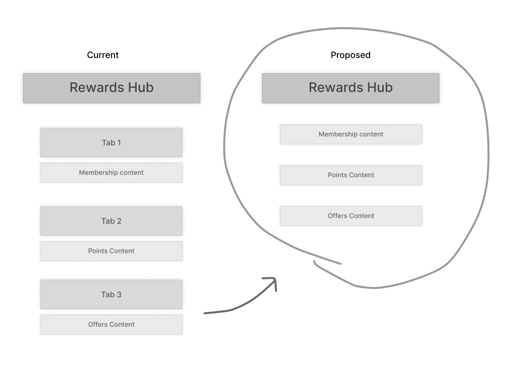
Hub Versus Tab Arhcitecture
Changing from a tabbed architecture to centralized hub improves navigation and content categorization.
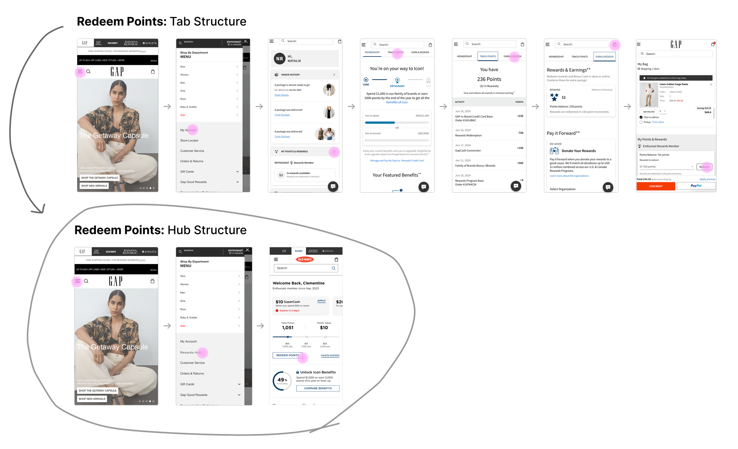
Shorter User Journeys
Moving to a hub approach shortened core user journeys by as much as 50%+
System Consolidation
Reduced redundant component and interaction variants by consolidating functionality into flexible, multi-state components that support all use cases.
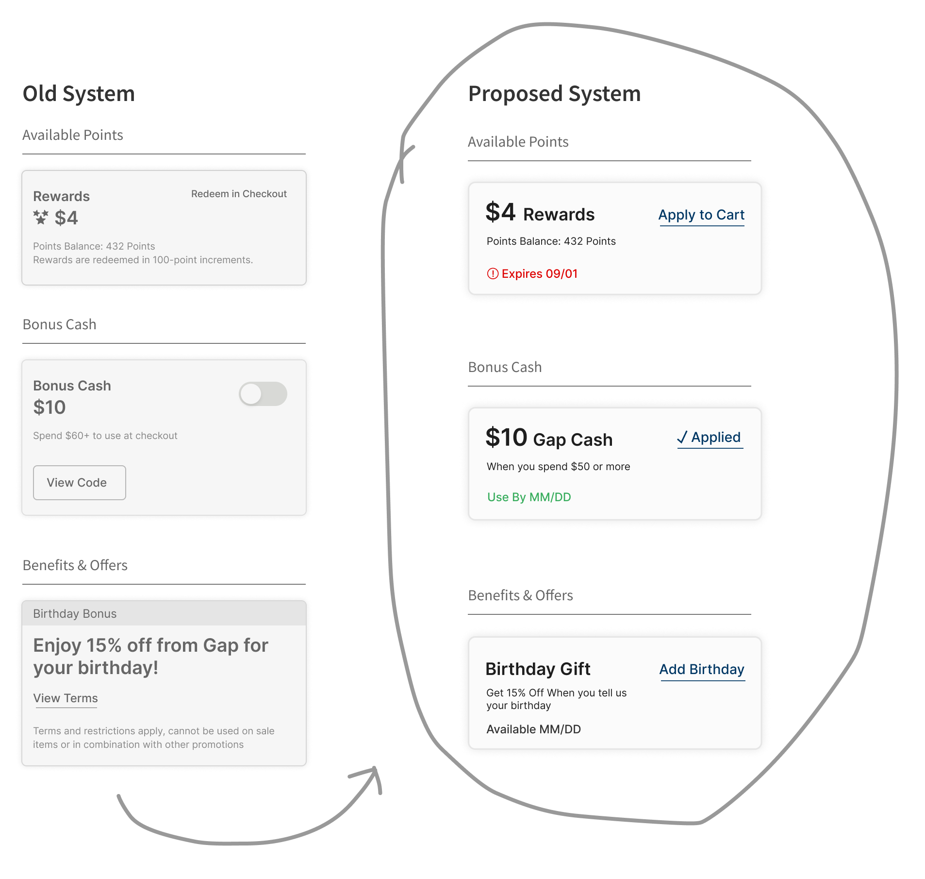
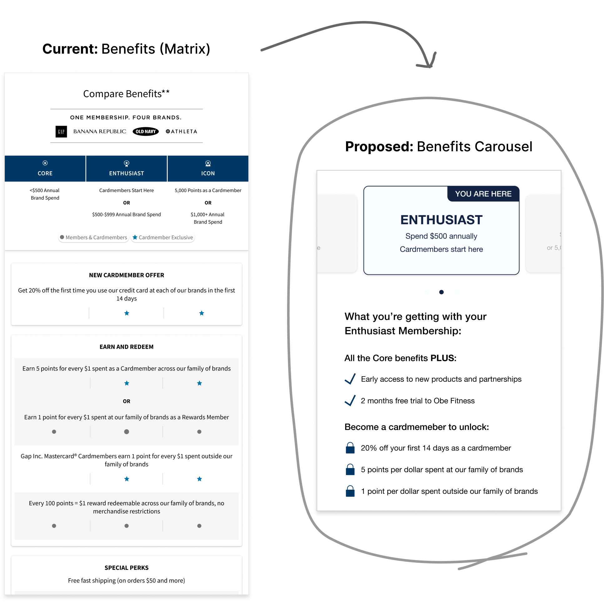
Improved Content Legibility
Changing from hard to scan matrix to compact carousels Helped to Reduce the page length by over 30% on app & mobile web
Full design system build
Once issues around Information architecture, functionality and legibility were addressed we built out the design system from the atomic level.
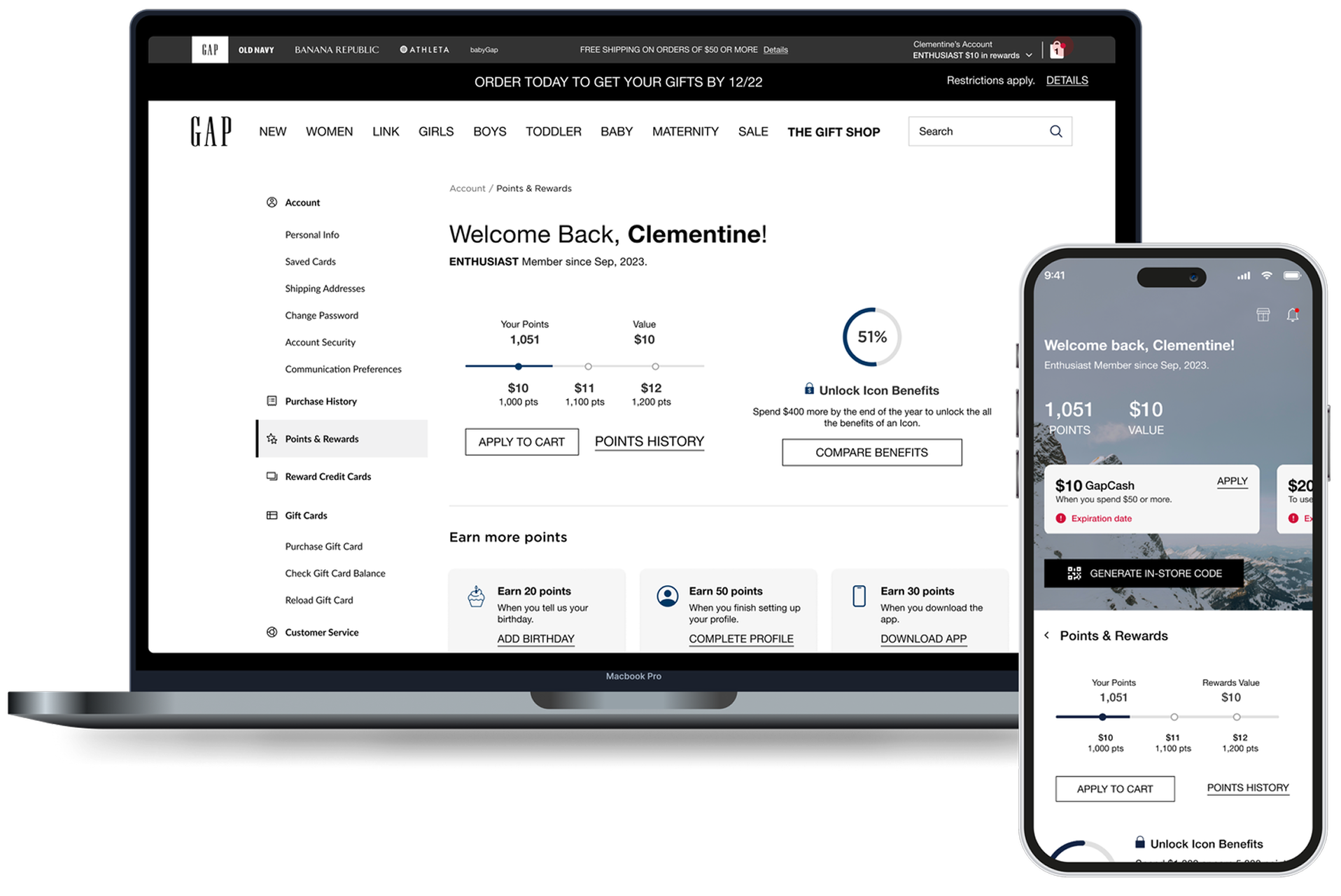
App + Web
We ensured full parody across app & web both for look and feel but also architecture and navigation
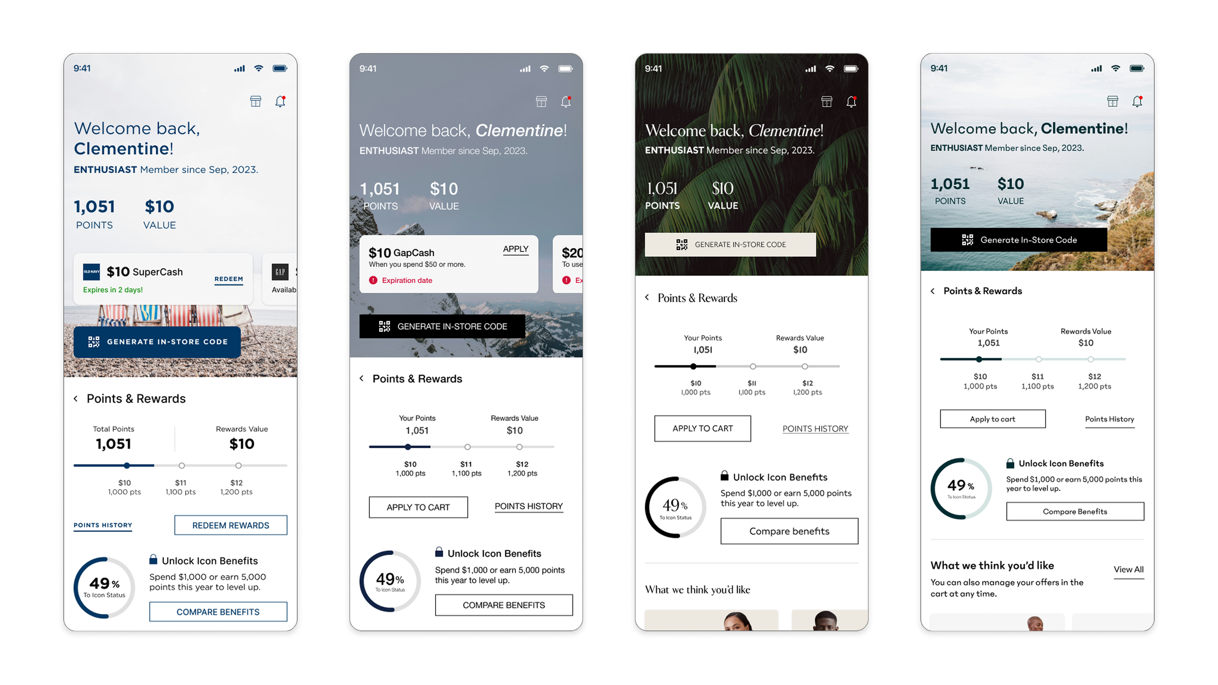
Brand Theming
Brand styling was applied to each App
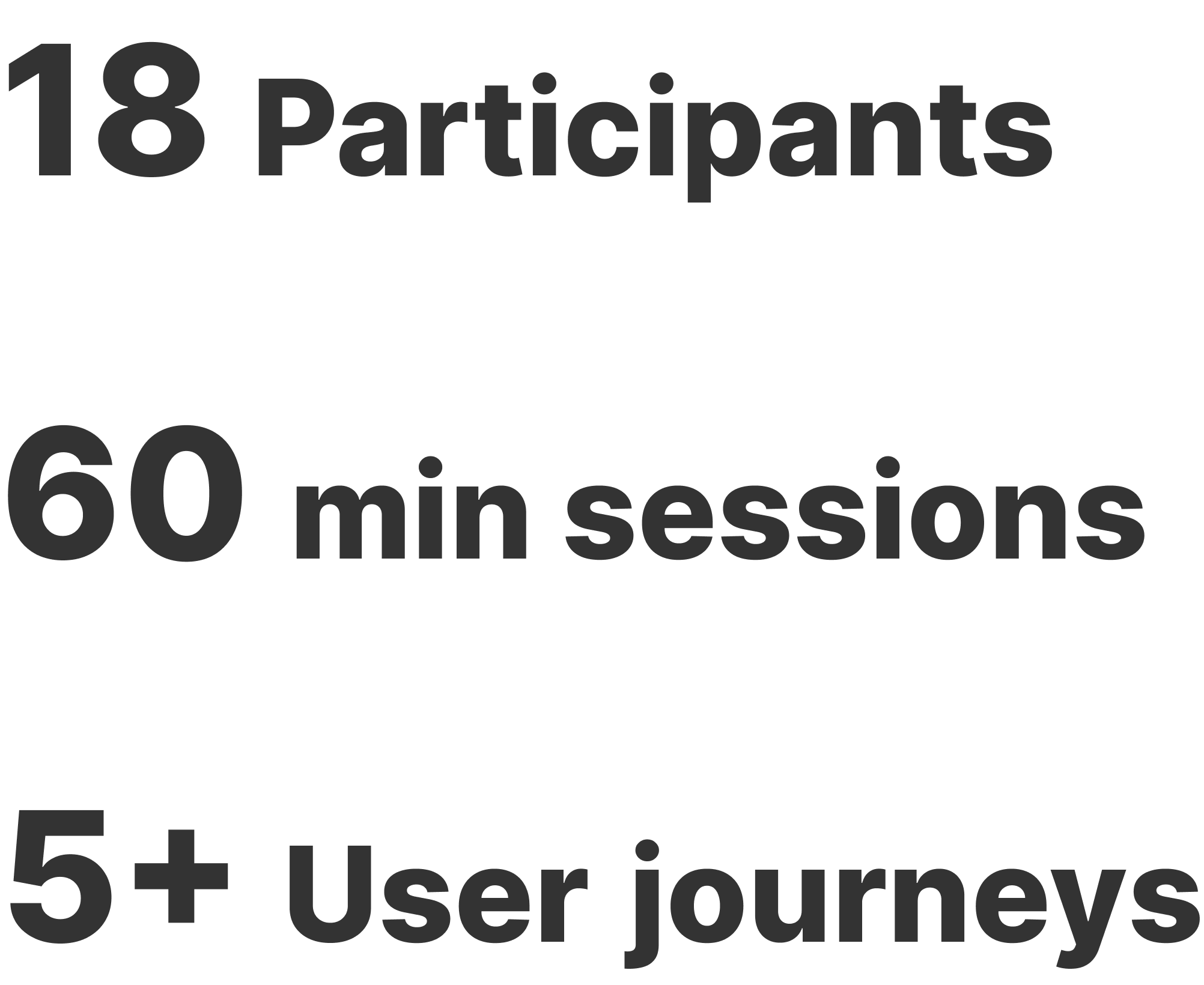
Customer Validation
User TEsting
Gap Inc. Rewards members participated in usability testing to evaluate deal discovery, personalization, points redemption, and offer application experiences.
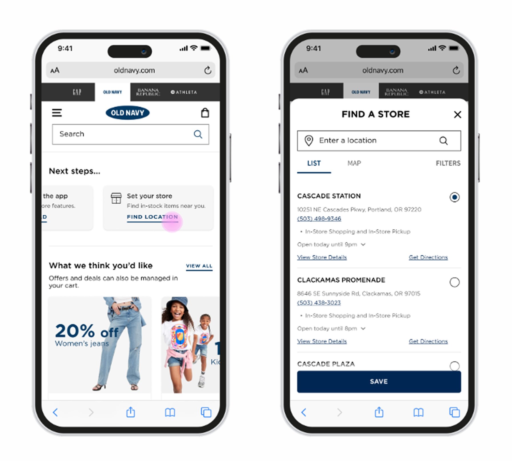
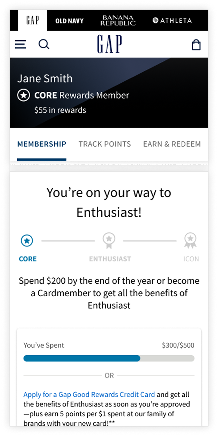
Adding & Editing Information
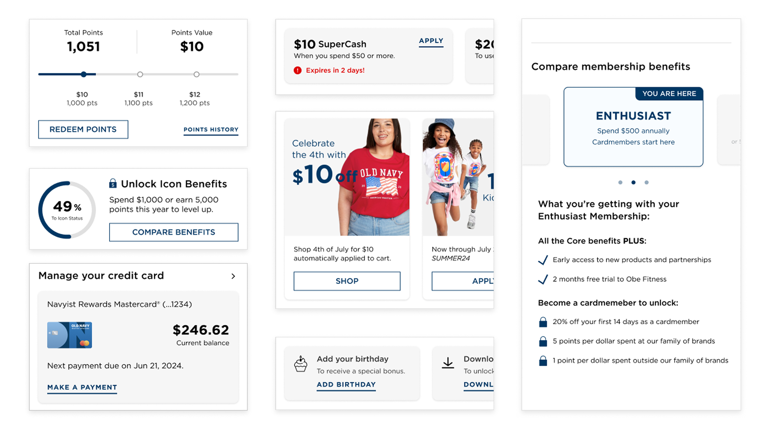
Tasks such as adding your birthday or setting your store were clear to users who said they liked being able to add and edit information without being pushed to another page.
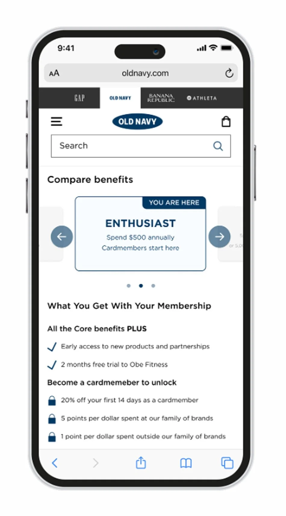
Comparing Benefits
Shoppers suggested that adding a benefits comparison feature to the Rewards Hub could improve their experience and help them better understand their choices.
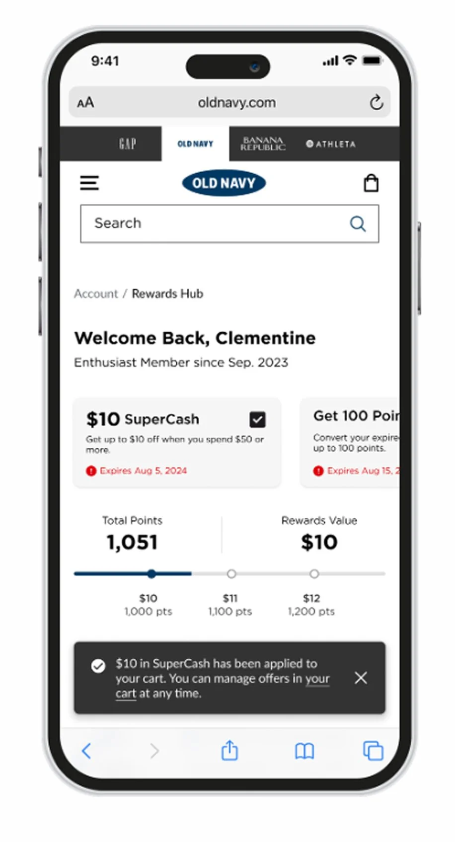
Time-Sensitive Offers
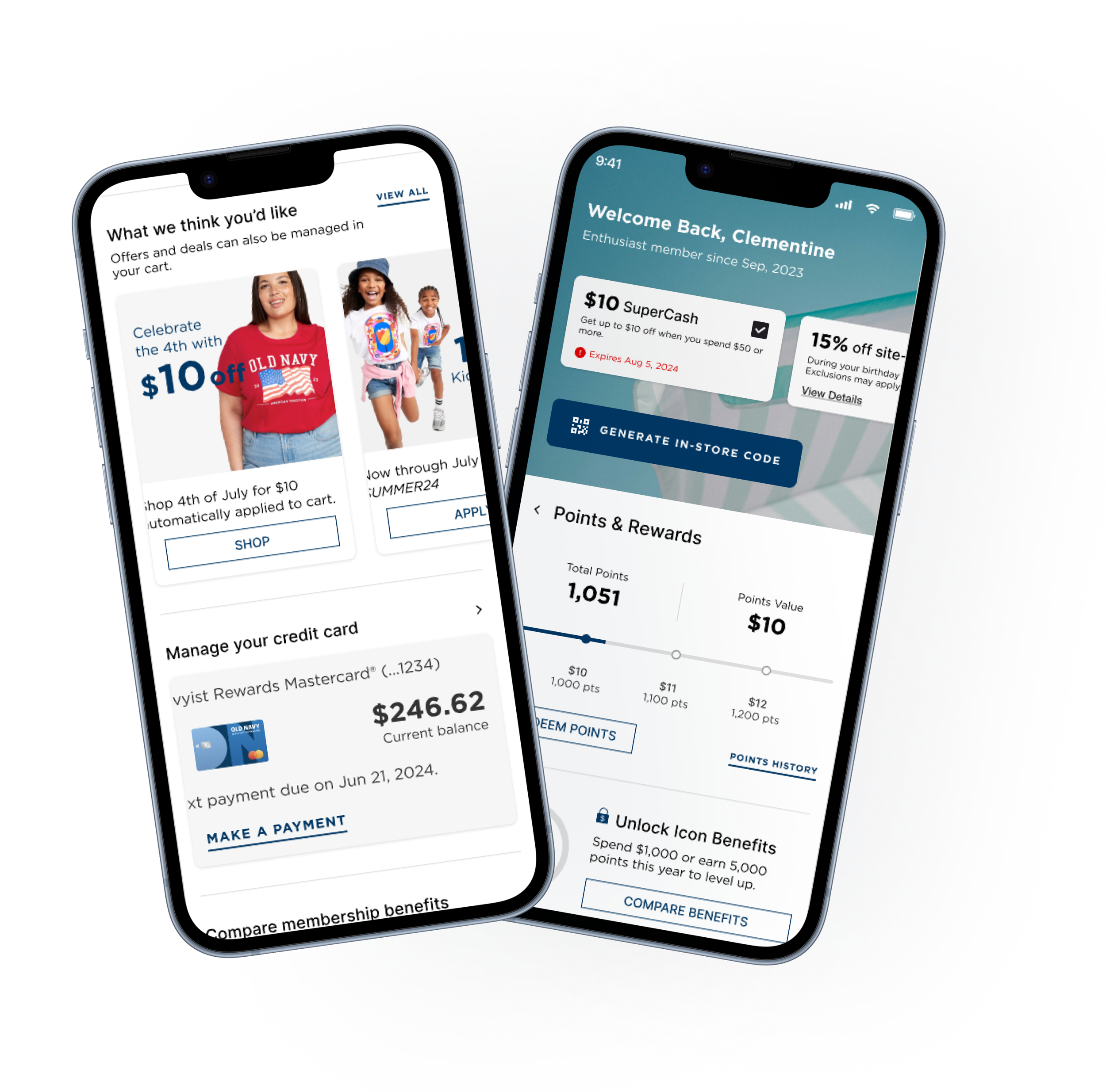
According to test users, the time-sensitive offers were easy to find and apply. The card design, with striking graphics and bold red text for expiration dates, effectively caught their attention and communicated the urgency of these actions.
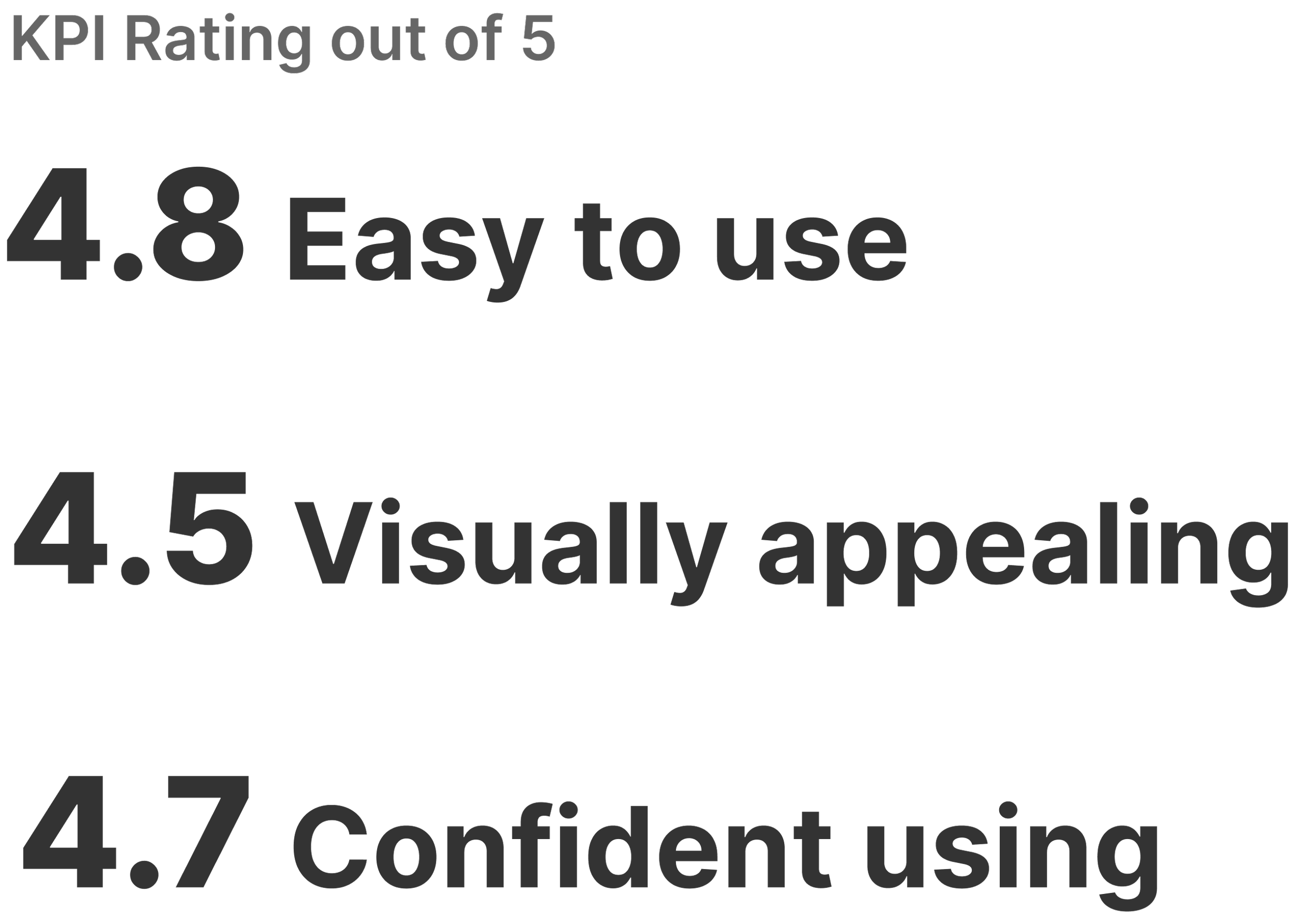
User Testing Results
User testing validated that the new Rewards Hub experience better supports user goals, driving outcomes that align with key business objectives.
Final Results
The New Rewards HUb
Better architecture surfaced rewards more effectively
Improved functionality streamlined the user experience
Improved content clarity enabled more informed shopping decisions